The Heading block should be used for the main title on the first page of your story. It can also be used across other pages, but we recommend using the copy block for any text that is longer than a few words. You can find more detail about each below.
Block Settings
The Block Settings are visible in the right hand side of the editor and will show up when you click on the Heading block. If the block settings aren’t visible, click the gear icon in the top right corner, or use the keyboard shortcut SHIFT + CMD + ,
There are a variety of collapsible panels in the settings bar that will allow you to further customize the headings block. Expand the section(s) below to learn more about the options each panel provides.
Typography
The typography panel allows for control over multiple options: heading level, font family, font size, color, line height, letter spacing, opacity, text transform, text shadow, and hyphenation.
Heading Level
Select the applicable heading level. Note that H1 should be reserved only for the title of the story, and most other pages will use an H2.
Font Family
Select from a dropdown of different font families to choose. The font family will update live for you in the editor so you can preview each option. If it isn’t updating, please ensure you are using `https`.
Font Size
Control the size of your heading text. The slider ranges from 10 to 200 in increments of 1. When selecting a font size, please be mindful of leaving enough room for the text to fit within the boundaries of the page. If your text is too large and spans multiple lines, we recommend using the hyphenate option.
Color
Choose from BU Stories’ or your theme’s pre-defined color palette. Optionally, you can also choose your own custom colors. Just make sure to keep contrast and readability in mind—it’s important that the content is accessible to all users.
Line Height
Adjust the height that an individual line of text will take up. Decreasing this will bring the lines of text closer together, while increasing it will move the lines of text further apart. The slider ranges from 0 to 2 in increments of 0.5.
Letter Spacing
Adjust the space between letters of text, also known as kerning. Decreasing this will bring the letters closer together, while increasing it will move the letters further apart. The slider ranges from -10 to 10 in increments of 0.25.
Opacity
Adjust the opacity of the text. Decreasing this will make the letters more transparent, while increasing it will make the letters more opaque. The slider ranges from 0.2 to 1 in increments of 0.1.
Text Transform
Select the desired text transform from a dropdown of options.
Text Shadow
Select the desired text shadow from a dropdown of pre-defined options. Text shadows can be one method to improve visibility of text that is on top of a background image.
Text Stroke
Text Stroke Width
Adjust the text stroke width. The slider ranges from 0 to 5 in increments of 0.5.
Text Stroke Color
Choose from BU Stories’ or your theme’s pre-defined color palette. Optionally, you can also choose your own custom colors.
Background
Background Color
Choose from BU Stories’ or your theme’s pre-defined color palette. Optionally, you can also choose your own custom colors.
Opacity
Adjust the opacity of the text background color. Decreasing this will make the background more transparent, while increasing it will make the background more opaque. The slider ranges from 0.005 to 1 in increments of 0.05.
Padding
Adjust the padding of the text container. The slider ranges from 0 to 25 in increments of 5.
You can also adjust the padding of the heading block, even without a background color selected.
Border
Note: the border will not display unless a border style and a width < 0 are selected. Unless a border color is selected, the color will default to black.
Border Color
Choose from BU Stories’ or your theme’s pre-defined color palette. Optionally, you can also choose your own custom colors.
Border Width
Adjust the border width. The slider ranges from 0 to 5 in increments of 1. You have the ability to either control the border width by individual side or set all borders to the same width.
Border Style
Select the desired border style from a dropdown of pre-defined options.
Margins
Control all 4 margins (top, right, bottom, left) with individual sliders, ranging from -100 to 100 with an increment of 1. Alternatively, check off `Set all to same value` if you would like to adjust all margins at the same time.
Adjustments
Adjust the rotation of the heading block with a full range of 360 degrees.
Animation
Select an optional text animation from a dropdown of options.
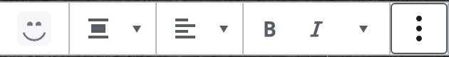
Text Panel Settings
The Text Panel Settings are visible directly above the selected block in the editor. There are a variety of options that allow you to further customize the headings block.
Alignment
Change the text alignment.
Bold and Italic formatting
Make text appear bold and/or italic.
Highlight Text
Click the small arrow next to italic icon and you’ll see an additional dropdown. Select highlight text and choose a color for the highlight. If you want only a specific word or phrase highlighted, simply highlight the desired text and then apply the highlight color to it.
Text Color
Click the small arrow next to italic icon and you’ll see an additional dropdown. Select text color and choose a color for the highlight. If you want only a specific word or phrase highlighted, simply highlight the desired text and then apply the highlight color to it.


