Widgets
A widget is an easy way to bring things to your navigation or custom text into your sidebar or footer. You can add widgets through the customizer by going to Appearance > Customizer, where you can see a live preview of your widget, or you can do it the old-fashioned way by going to Appearance > Widgets.
This theme support widgets on the sidebar of the Default page.
Widgets supported in this theme
Content Navigation
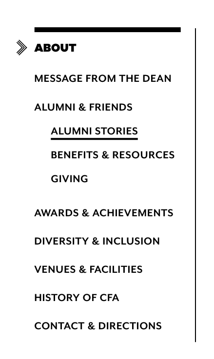
This is a sidebar navigation list of your site’s pages. It’s best to keep this widget at the top of your sidebar.
- Site: Will always display the full site navigation, from the very top. Not recommended.
- Section: Displays the navigation based on the section you’re in. This is the most common pattern for secondary navigation on the web. Recommended.
- Adaptive: Will adjust the navigation display based on whether the current page has child pages. If it has child pages, the current page will act like the section title, and you will not see any other pages on the same level. If it doesn’t, it will act like a link and you will see pages on the current level in the navigation. Because you have to carefully monitor how child pages are used to prevent a “jumpy” feeling in the navigation, this option is generally not recommended unless you have training in information architecture.
BU Text
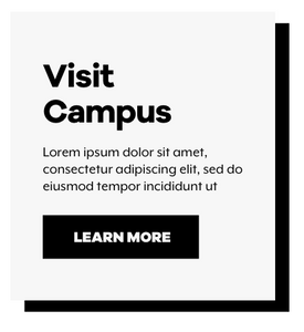
Widget for adding markup to a sidebar for a single Page or a Section. This is an especially good option for adding custom callouts on various Pages or Sections, such as application callouts with different links for undergraduates and graduates. You can also use this widget to only show something in the sidebar on a certain page.
Markup for BU Text Callout box:
Grey background:
<div>

<h3>Visit Campus</h3>

Lorem ipsum dolor sit amet, consectetur adipiscing elit, sed do eiusmod tempor incididunt ut

<a class="button" href="#">Learn More</a>

</div>
Green background:
<div class="green">

<h3>Visit Campus</h3>

Lorem ipsum dolor sit amet, consectetur adipiscing elit, sed do eiusmod tempor incididunt ut

<a class="button" href="#">Learn More</a>

</div>
Pink background:
<div class="pink">

<h3>Visit Campus</h3>

Lorem ipsum dolor sit amet, consectetur adipiscing elit, sed do eiusmod tempor incididunt ut

<a class="button" href="#">Learn More</a>

</div>
Blue background:
<div class="blue">

<h3>Visit Campus</h3>

Lorem ipsum dolor sit amet, consectetur adipiscing elit, sed do eiusmod tempor incididunt ut

<a class="button" href="#">Learn More</a>

</div>
Yellow background:
<div class="yellow">

<h3>Visit Campus</h3>

Lorem ipsum dolor sit amet, consectetur adipiscing elit, sed do eiusmod tempor incididunt ut

<a class="button" href="#">Learn More</a>

</div>