Edit the Main Navigation
When setting up your site’s header navigation, focus on adding only the most essential links based on Creative Services’ strategy.
Keep links, and navigation labels consistent, clear, and logical so that users know exactly what to expect when they click.
Main Navigation Layout Options
Navigation layout options are available from the WordPress admin dashboard under Appearance > Customize. In most cases: you should use the default layout, or whatever layout has been designated by Boston University’s Creative Services department.
Default
The default navigation layout will support as many top-level navigation items as you have allowed in Appearance > Primary Navigation.
Top
The top navigation layout displays your navigation above the branding.
Side
The side navigation layout displays your navigation on the left side. Side navigation is highly recommended for sites with a relatively flat navigation structure. If you have five to seven top-level pages and none of them have child pages, this is a great choice for your site.
Mega
The Mega Navigation layout provides a clean, segmented menu structure that (depending on the design) either folds-out from the header or fades-in as an overlay atop the page. While it separates the menu from the site, its presentation provides greater focus.
None
You can choose not to show navigation at all. This is a great option for single-page, product landing sites.
Editing the Main Navigation
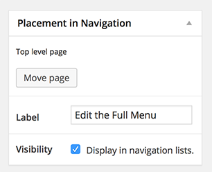
From any top-level page of the site: Add or remove items from the full menu by checking/unchecking the “Display in navigation lists” tab.
Keep in mind that the full menu is limited to seven items and will pull in the first seven top-level pages with this item checked, as determined by the order you select in Pages > Edit Order.
By default, your site was set up to strategically support up to seven top-level navigation page item links. If you need more links than this, maybe it’s time to rethink or consolidate the pathways to information that feel logical for your sites users. Have they been thoughtfully selected and organized? Could you be taking better advantage of linking in your pages? Or do some of your main navigation items belong in the utility navigation, instead?
The key to simple and clear navigation is giving users options that point them in the right direction without overwhelming them with too many choices.
It’s like driving directions: Clear, basic instructions are easy to follow. Complicated steps and too many roadsigns along the way make a trip difficult. Avoid giving your user’s analysis paralysis by limiting your main navigation to five to seven items.
Required settings for the Main Navigation in Responsive:
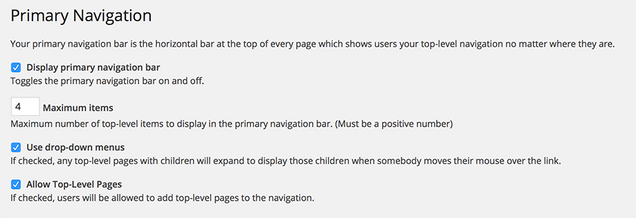
In your site’s WordPress Admin, under Appearance > Primary Navigation:
- Display primary navigation bar should be checked.
- Maximum items—seven: You may use more if you are using the default navigation layout. It’s recommended you leave this at seven.
- Use drop-down menus can be checked if you want to support drop-down menus. Keep in mind this is not recommended for touch devices. If you leave this unchecked, be sure to add a Content Navigation widget so that users can still get to child pages when they go to a top-level page.
- Allow Top-Level Pages should be checked.
Troubleshooting Main Navigation
If an item isn’t showing in the main navigation after you click, follow this list to double-check that everything is set correctly:
- Display in navigation lists is checked on the page you want to show in the full menu.
- There are only six other top-level pages set to display in the navigation. If there are more, they will not show. Responsive supports up to seven navigation items.
- You have not added any Custom CSS that may interfere with how the full menu functionality works.
If none of the above fixes the problem, submit a ticket to IS&T and someone will look into the problem further.